Many people enjoy using Jetpack's Gallery Carousel lightbox (personally I usually go with: Gallery Carousel Without JetPack), it is indeed very good and stable solution. But it has one "week" spot - the carousel Close button.
My recent client voiced a concern, that website visitors might get frustrated, because it is very hard to spot the mini "X" awkwardly positioned on the left side. I totally agree with my client, usability is such thing, that visitor should not spend even a second thinking where to find crucial navigation element that should bring him back to the website.
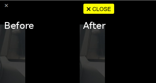
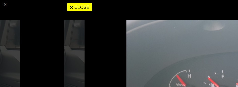
Interestingly enough, I didn't find any good fix on the internet, so I'm posting my CSS code. First let's look what we will get from this:

You can test it in Tiny Framework showcase gallery.
Now the code. Add it to your child theme's style.css file (I usually paste it in section: 14.2 Misc. styles) or paste it into your custom CSS plugin:
/* JetPack Gallery Carousel close button */
.jp-carousel-wrap .jp-carousel-close-hint {
 margin-top: 5px;
}
.jp-carousel-wrap .jp-carousel-close-hint span {
	background-color: #fdff00;
	color: #000;
	font-size: 30px !important;
	height: 33px;
	padding: 3px 5px 0 3px;
	width: 100px;
}
.jp-carousel-wrap .jp-carousel-close-hint span:after {
	content: "CLOSE";
	font-size: 18px;
	padding-left: 3px;
	vertical-align: 25%;
}
.jp-carousel-wrap .jp-carousel-close-hint span:focus,
.jp-carousel-wrap .jp-carousel-close-hint span:hover {
	background-color: #dddf00;
}
I tried to position button on the right side, but was not successful, anyway, I gave it big prominence, so it should catch attention quickly 🙂 Also big thanks to guys for vertical-align tip that made it possible to get all button elements nicely arranged.
Now you have Bigger, Brighter and Better carousel Close button! 😀
